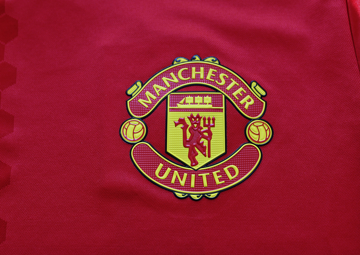
Manchester United FC
Could Manchester United follow the simplified club crest trend?
Over the last few years many clubs have evolved their crest in an attempt to simplify the motif for use in the digital age. One of the more recent and high profile changes was Juventus one of the all-time greats of Italian football.

Closer to home clubs like Liverpool, Spurs and Aston Villa have all successfully simplified their badges to be simpler and more modern. Both Everton and Leeds also attempted the challenge but quickly backtracked after public outrage. Whilst Wolves have always had a logo ahead of its time.
What we did...
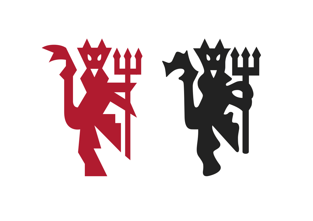
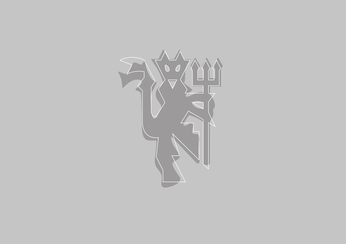
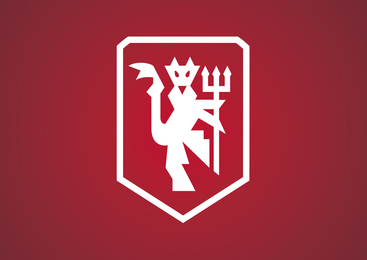
What we have attempted to do here (in 60 mins remember), is to follow this trend for the world's greatest and most historic football club – Manchester United. We focussed on redrawing and bringing the Red Devil (the club nickname) to the fore. This is cleaner, more contemporary, more dynamic and if nothing else – cooler. We have also taken this minimal approach to the extreme by removing all typography and utilising a flat single colour approach.
PLEASE NOTE: As a season ticket holder myself I appreciate this is a passionate subject and everyone will have and opinion. However, it is has been attempted as a fun design exercise, not necessarily as a recommended direction.
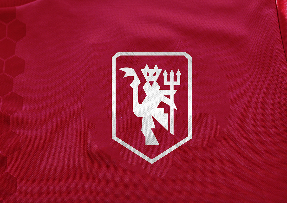
60min Makeovers is an internal Truth project where we take a popular brand and refresh it in under an hour. It is just for fun and is undertaken with no insight or knowledge of the brand's future strategy. It is purely cosmetic and for our own pleasure.