Wellman
Vitabiotics was founded in 1971 by Karjar Lalvani, father of BBC ’Dragon’ Tej Lalvani. Vitabiotics distributes popular brands such as Wellman, Perfectil and Pregnacare in more than 100 territories, building a £300m enterprise in the last decade alone. Wellman is the UK’s number one supplements brand with a mission to ’live life well’ and also caters for women, teens, children and babies (through affiliated ‘well’ brands).
Why a makeover?
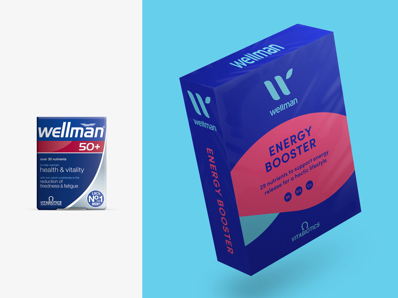
We believe the identity is not representative of the modern health and wellness industry or what is an extremely successful and high profile brand. Dark colours and heavy type dominate the packaging, whilst unnecessary shadowing and gradients recall a design practice that is a good 20 years out of date. As a thriving enterprise Wellman has expanded into women’s and children’s healthcare (and beyond) but the current identity doesn’t create a clear brand framework, as a result the offering is very fragmented and referred quality between brands is lost.
Our makeover is an exploration of how we can modernise the brand but also how we can create unity under one cohesive yet flexible brand.
What we did
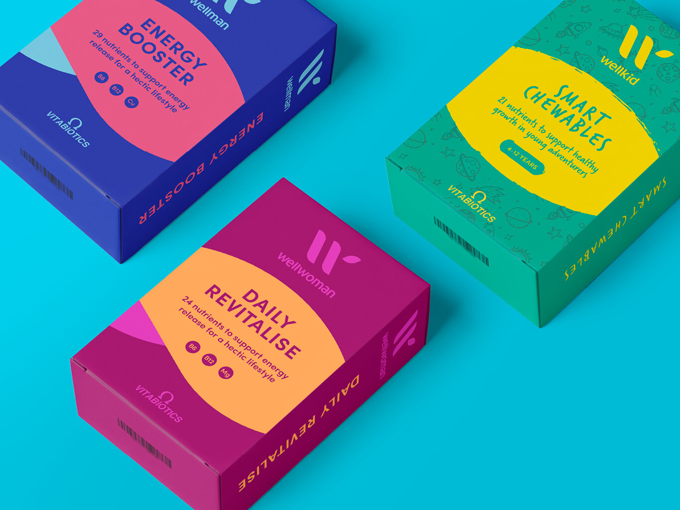
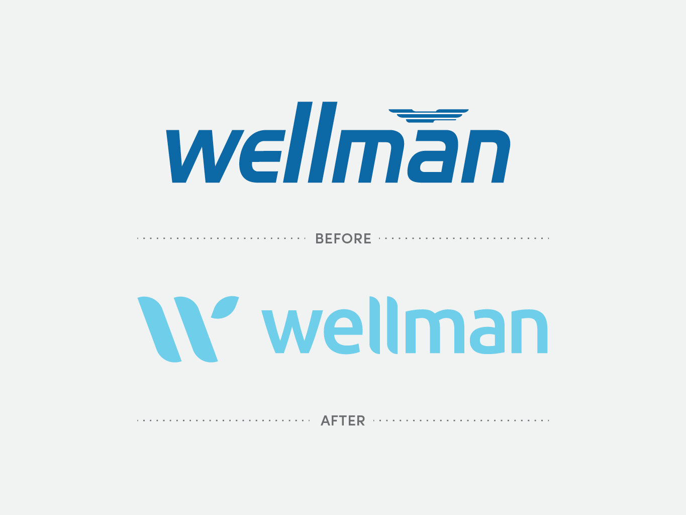
As an already successful brand it was important that we keep an essence of the identity rather than wholesale changes. The logotype has been refined with a lighter weight, softer curves and the unnecessary obliques have been removed. Combined with a brighter colour palette (based on existing tones) Wellman feels more uplifting and more representative of the product – creating a mental and physical boost. We also looked at a cleaner pack presence, with a large lozenge to communicate points of difference and key benefits while more white space to create a cleanliness and sense of wellbeing. This approach also transfers nicely into Wellwoman (where softer more feminine tones are employed) and Wellkid (which has a more ‘adventure ready’ feel) whilst still remaining true to the established hierarchy.
We recognise it is a large task to refine a brand that already has such a large portfolio within a global marketplace. We hope these first steps provoke and inspire what ‘Wellman’ could – and perhaps should – be.