
SPAR
Founded in The Netherlands over 85 years ago and with 13,112 stores in over 48 countries on four continents, SPAR serves over 13.5 million customers globally every day. But is the 52-year-old branding still relevant?
Why a makeover?
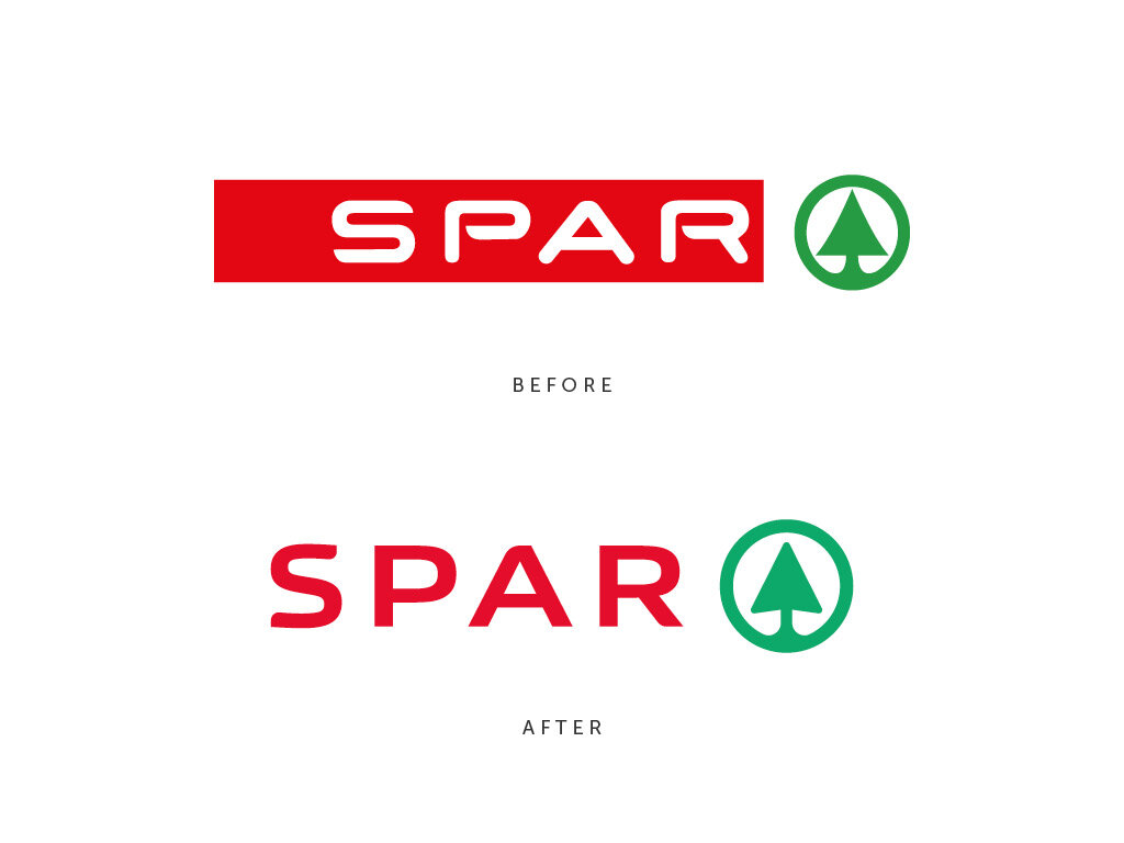
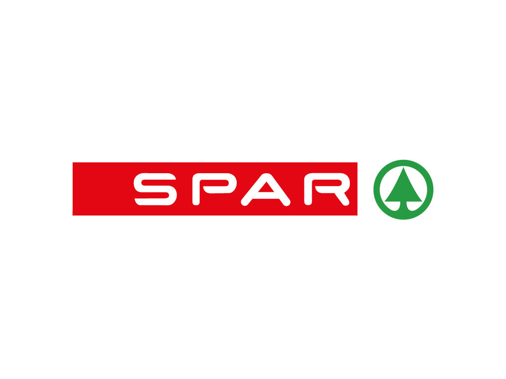
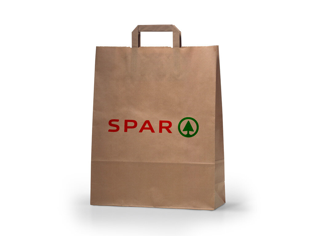
Having grown up visiting SPAR stores in the UK and also passing at least four of their stores on my daily commute, I have often pondered how I would change this brand whilst sat in traffic. Surprisingly the current type mark first appeared in 1968 and remains relatively unchanged 52 years later. This type style although innovative at the time hasn’t aged well and looks very dated. It feels more like a 1960s vision of the future, more akin to NASA than a 21st-century convenience store. The red block seems awkward and unnecessary, and the tree motif is badly proportioned and spaced.
What we did
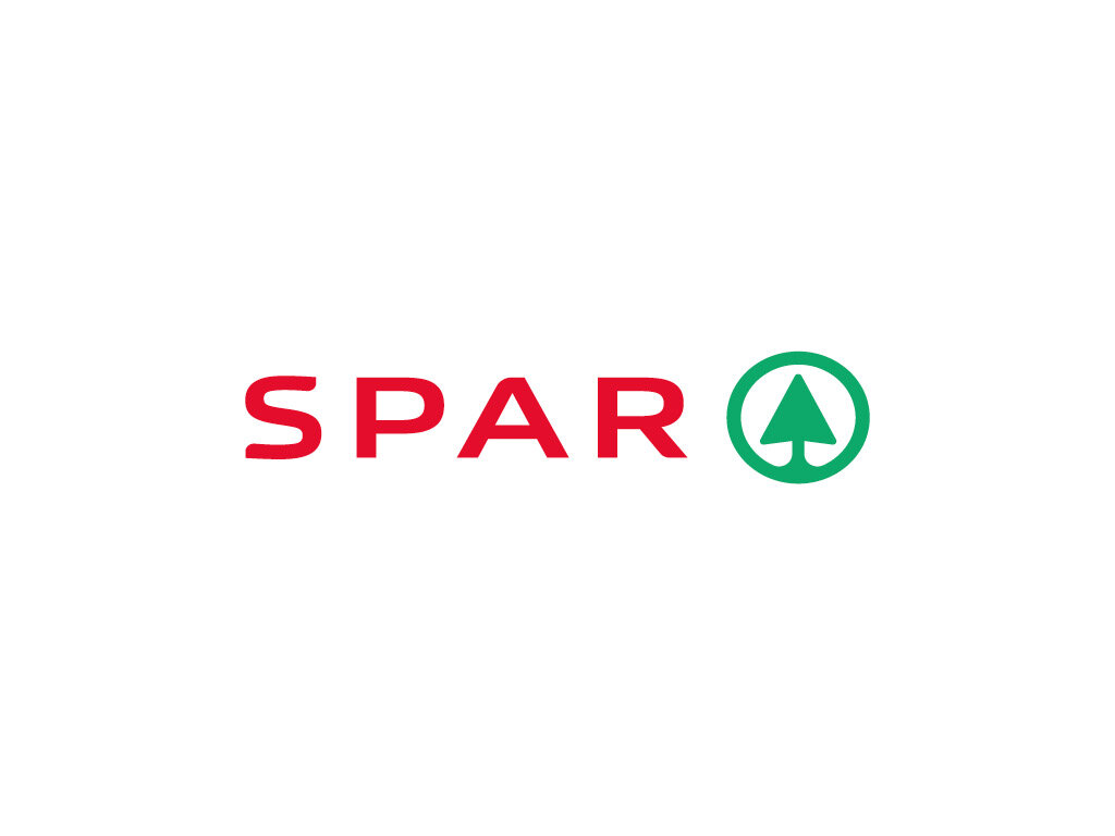
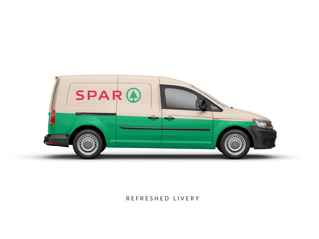
The first thing to address was the typeface, having tried and failed to refine it in its current form, it had to go. In its place is a custom type mark with a sense of evolution coming from the wide characters with round corners, albeit to a lesser extent. The tree motif has been redrawn to work better at smaller sizes and to give it a refresh. The green has been changed to a less primary green to soften and modernise it, the red has also been tweaked, and a beige colour added based on historical references. Overall the make-over retains the essence of the brand but evolves it enough to create a fresher more modern appearance. But remember it was done in under an hour and just for fun.


60min Makeovers is an internal Truth project where we take a popular brand and refresh it in under an hour. It is just for fun and is undertaken with no insight or knowledge of the brand's future strategy. It is purely cosmetic and for our own pleasure.