Lufthansa
Refreshing the brand and setting the bird free.
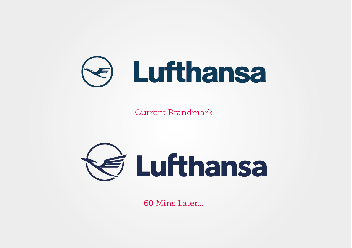
Lufthansa is a long established brand in the aviation sector and has a well-recognised identity in the eyes of the consumer. However, the logo looks dated and doesn't function well across modern media channels. The Crane Motif is lost within the circle at smaller sizes and it feels awkward as it isn't drawn particularly well or well proportioned.
What we did...
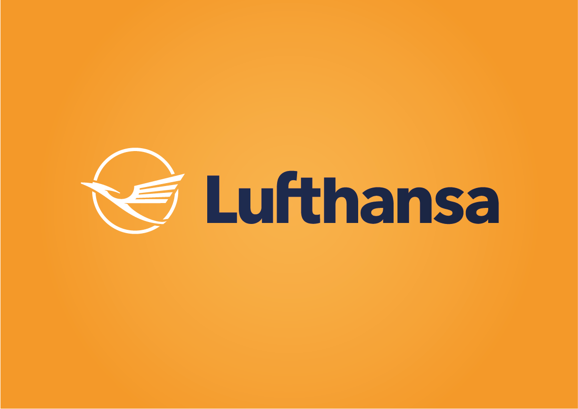
Our quick refresh retains the equity that Lufthansa has in the Yellow Ochre colour and also in the circular device containing the crane in flight. We have redrawn the Crane Motif so it breaks the circle to place greater emphasis on the crane than the circle. We have made it more dynamic and streamlined, allowing it to work better at smaller sizes on screen. The circle now acts more like the sun with the crane soaring in front of it. We have refreshed the generic type mark to be more distinctive by adding in the ft ligature. The chosen typeface has been recut to create a fresher look with more personality and distinction.
It was done quickly, but we feel we have refreshed it without losing the overall feel of the original.


60min Makeovers is an internal Truth project where we take a popular brand and refresh it in under an hour. It is just for fun and is undertaken with no insight or knowledge of the brand's future strategy. It is purely cosmetic and for our own pleasure.