KLM
Harnessing Dutch passion and pride.

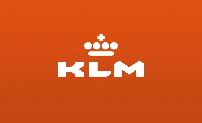
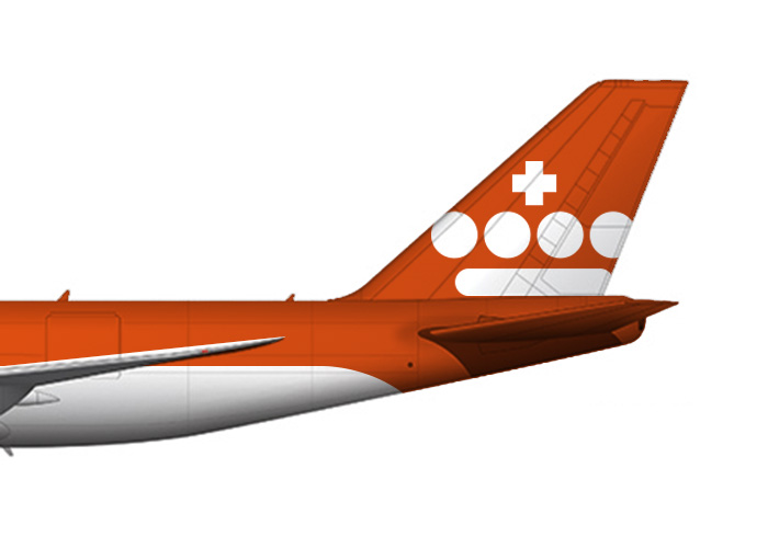
Although the KLM mark is a undoubtable classic, it is looking tired and is in desperate need of a refresh.
What we did...
What we have attempted to do here (in 60 mins remember), is to improve the spacing between the individual elements within the crown to prevent it optically 'filling in' at smaller sizes on screen and in print.
The type has also been refreshed to be more dynamic and contemporary. The lettering is bespoke and would ultimately form the basis of a brand font. The colour has been changed to orange as this is the colour most synonymous with the Dutch the world over.
60min Makeovers is an internal Truth project where we take a popular brand and refresh it in under an hour. It is just for fun and is undertaken with no insight or knowledge of the brand's future strategy. It is purely cosmetic and for our own pleasure.