

Life Cycle of a Brand
Your brand mark (or logo if you prefer) is the face of your brand, the thing people relate to, they either like your face or not. Yeh, ultimately it’s what’s inside what counts, and that is where ‘Brand Experience’ comes in. But, as we all know, a good first impression is vital, so your face needs to fit. As brands get older they pass through many stages of their life.
Your brand mark (or logo if you prefer) is the face of your brand, the thing people relate to, they either like your face or not. Yeh, ultimately it’s what’s inside what counts, and that is where ‘Brand Experience’ comes in. But, as we all know, a good first impression is vital, so your face needs to fit. As brands get older they pass through many stages of their life.
New Arrivals.
New brands have a baby face, cute, new, and refreshing. They are a novelty at first until the reality sets in. You take pleasure watching them learn to walk. But what will they look like, as they grow older. The choices you make now will affect them forever.
The Rebellious Teenager.
A teenage brand has a changing face; it moves with the times, it may change its looks with fashion as the decades pass. It thinks it’s a rock star. It has a snarl on its face, an attitude; it thinks it knows absolutely everything. But it still needs the steady hand of discipline or it will self destruct, and eventually leave the rails.
Mid-Life Crisis.
As your face gets older you start to panic, should I change. You don’t know whether to twist or stick, gamble or amble. Do you do something drastic and become a 30 something rebellious teenager? You could end up looking like your dad dancing at a disco. Or, do you learn to deal with the fact you are becoming a grandad.
The Weathered Look.
Some brands have a tired look; they may have let themselves go a bit. Or been out in the wilderness for some years. Usually this can be reversed without the need for plastic surgery. Usually just a good scrub, a good shave and a sharp haircut will do the trick.
The Grandad.
The more mature brand is like your grandad. It has a distinguished face that commands respect, but is also equally loved. It has slowly matured as it has survived life’s challenges. Older faces don’t need to be radically altered. If your grandad gets a haircut he is just a sharper version of your grandad, right?
He looks a bit fresher, maybe even younger. If he has a nose job, a facelift, or maybe even dyes his hair, people will laugh, and never look at him the same again. The damage is done and you undo all the years of building up your well respected reputation.
There are plenty of brands that are great successes and almighty failures in each of these stages. There are no good or bad stages here, just correct or incorrect brand positioning and execution.
To understand what stage your branding is in, give us a call!
Written by
Darren Scott
Founder / Creative Director – Truth

Brands as religion
Many modern brands have become mini-religions or achieved cult status. Social media has allowed brands to offer themselves up to be worshipped.
Brands have followers, fan pages and every retweet effectively makes you a preacher for your brand of choice.The passing of the collection plate has been replaced by subscription fees, and baptism by loyalty schemes as brands encourage consumers to commit and to spread the gospel of their brand.
Thou shalt worship false idols!
Many modern brands have become mini-religions or achieved cult status. Social media has allowed brands to offer themselves up to be worshipped.
Brands have followers, fan pages and every retweet effectively makes you a preacher for your brand of choice.The passing of the collection plate has been replaced by subscription fees, and baptism by loyalty schemes as brands encourage consumers to commit and to spread the gospel of their brand.
Brand values have become the new commandments, the foundations every brand scribes to define their faith. A recognisable brand mark adds value to what you offer, it allows you to stand out from the crowd, and it can build relationships with your customers. But it doesn’t stop there, consuming a brand has become an experience, a lifestyle choice, a way of saying this is what I am all about, I believe in this.
Consumers tend to align themselves with like-minded brands. It says:
“Hey, I believe in what you’re doing, let’s do it together”.
Apple has achieved this by constant innovation and projecting an über cool attitude towards design innovation and customer service. They believe they can change the world, their believers think they can change the world, some believe they already have. As a result their customers are loyal and freely share their love for the brand, they are Apple ‘disciples’ if you like. They wear the brand like a badge of honour, with sense of pride and belonging.
This trust and loyalty allows Apple to drive the brand into new areas applying the same Brand philosophies as they go. The consumers now automatically believe their products WILL be better and WILL be cooler.
This blind devotion is THE ultimate in brand loyalty, it is the promised land.
Faith.
Like any religion, brands want people to have faith in what they have to offer. This faith leads consumers to have a life-long devotion to the quality of their brand. This leads to a sharing of beliefs and a growing following of devoted disciples.
Omnipresence.
The most successful brands try to be visible everywhere and to everyone. Many of the world’s most recognisable brands have achieved this. For example, the ‘Golden Arches’ of McDonald’s are arguably more widely recognised and prominent in modern society than many religious symbols.
Deities and Iconography.
Endorsements are big business, many icons of sport and entertainment align themselves with brands they believe in, or not. In fact, many of our modern ‘icons’ like Tiger Woods (fallen icon) and David Beckham have become global brands in their own right.
The Place of Worship.
You may have noticed that people still worship on the Sabbath day, just not in the same place anymore. The buildings still tend to be tall and instantly recognisable by the iconic signs and symbols. But, these temples are no longer made of grey stone and covered in crucifixes. They are the brightly coloured monolithic structures of B&Q and IKEA. These are now the weekend pilgrimage for many consumers.
Miracles.
Many technology brands perform what many would consider modern ‘miracles’.
When Sony launched the Walkman in 1979, people were able (for the first time) to carry music around in their hand. Many doubted it, but it changed the music industry and went on to become the biggest selling electronic consumer product in history. This made Sony a global super brand. Apple performed a similar miracle when the late Steve Jobs (God bless his soul) turned the muddied water that was portable music into the fine wine that is now iPod and iTunes.
A Sense of Community.
The unstoppable rise of social networks has seen brands like Facebook become the worlds fastest growing ‘religion’, it is the already the biggest and most diverse community on the planet, it transcends race, language and geography. It brings more people together more than any other faith. It is so high and mighty that even the biggest brands worship it, even to the extent where they display their faith proudly in the form of a LIKE button.
So if new ‘religions’ are merging, talking, sharing values and faiths, is the world heading towards one divine super religion called the internet?
To discover the secret to brand worship for your business, let Truth show you the way!
Written by
Darren Scott
Founder / Creative Director – Truth

Should Tesco rebrand?
On a recent car trip my six year old son, Dylan, recently pointed out to me that he recognised a Sainsbury’s store, ‘because Sainsbury’s is orange’. Being a brand whore this intrigued me and I decided to quiz him further on other brands, and more specifically supermarkets. What colour is Waitrose I asked? ‘Green daddy, dark green’, he replied. ‘And Morrisons?’, ’Yellow daddy, and green too, but just a bit’, he replied. Asda? ‘Green’. Marks & Spencer? ‘Dark green as well, I know because grandma goes there’.
On a recent car trip my six year old son, Dylan, recently pointed out to me that he recognised a Sainsbury’s store, ‘because Sainsbury’s is orange’. Being a brand whore this intrigued me and I decided to quiz him further on other brands, and more specifically supermarkets. What colour is Waitrose I asked? ‘Green daddy, dark green’, he replied. ‘And Morrisons?’, ’Yellow daddy, and green too, but just a bit’, he replied. Asda? ‘Green’. Marks & Spencer? ‘Dark green as well, I know because grandma goes there’.
He adds that ’Netflix is red’ and that ‘Sky believe in better daddy!’. He also adds that ‘Ocado doesn’t have a colour, it has fruit’, (his knowledge of the Ocado brand is purely based on the vans that deliver to our home). Then I asked about Tesco, his reply? ‘I don’t know daddy, is it black?‘. Now, I know that I have taken him to a Tesco store on several occasions, but for some reason the branding had not registered with him.
I know that six-year-olds are not the target demographic for Tesco, but I guess that they are not exactly top of the list for the other supermarket brands either. Maybe what the others have, is more brand presence or a better connection with consumers. Tesco is often criticised for being a faceless corporation, trying to take over the world, and as the second largest retailer in the world (based on revenue), you could easily argue they are. However, they are often accused (sometimes unfairly) of single-handedly destroying our high streets and squeezing the life out of our farming industry. For this reason alone they should be on the charm offensive, they should work extra hard on getting their personality right, and addressing the negativity through brand experience. Many of our other large supermarket chains are equally guilty of the same practises, but deflect it with brand experience, mask it with personality, and offset it with high profile CSR activity.
Obviously a six year old is unaware of the negative (or positive) press a brand might receive and all that surrounds it. A six year old is free to simply judge branding at face value and purely as a cosmetic solution, which is fascinating. Sometimes we could all benefit from looking at the world through the eyes of a child – that simple clarity, free from the white noise of our busy lives and corporate spin voodoo. They don’t over think things, they just say it as they see it, and it is beautiful to witness.
So, is it the branding?
A company’s branding is not only the delivery mechanism for their personality, but also the cosmetic veneer that envelops the brand experience and the company’s culture. Tesco has several aspects to its brand that buck the trend of most supermarket branding rules. But are they really faceless? I would say no, but as the brand is so sterile it is borderline generic, and so their face is forgettable. Bland would be a more accurate description, over brand. Now, this may be a deliberate ploy, based on market research or focus groups, but Tesco do little (visually) to make you warm to them as a consumer. This is bad news when you consider that branding is usually an all important first impression a company has on a potential customer.
Feeling blue.
Tesco has traditionally always used red and blue on white as their brand colours. Patriotic as this is, it feels sterile and cold. The blue headlines on white feel corporate or medical, not enticing and welcoming. As a brand, it lacks the warmth of Sainsbury’s orange and the tradition and prestige of Waitrose green. In fact, all it communicates is blandness and almost a lack of effort to connect with customers in a meaningful way. A warmer colour would go a long way towards injecting passion and warmth into their frosty appearance, and maybe even make them more emotive and human in the eyes of potential customers.
The clothes that their words wear.
The expanded serif typeface is overly spiky and angular, it feels tired and dated (not traditional), more appropriate for the signage on a medieval castle carved into stone, rather than a family supermarket. The use of capitals is SHOUTY, and it doesn’t have the warmth and personality of many of the other supermarkets. Ironically the softer Clarendon typeface that Tesco traditionally used is now embraced by several supermarkets, mainly because it has personality and a certain bounciness to it, that softens the message it is communicating. Competitors like Sainsbury’s use serif typography but it is softer and more flowing with its rounded bowls and tapered serifs, the use of lowercase is more personable and friendly. Waitrose use an elegant and rounded sans-serif that feels minimal and elegant to underpin their premium positioning. That is why the choice of typeface is a key part of any branding project, it is the accent with which your words speak, and it speaks volumes about your brand.
Personality check.
Tesco lacks a face or a recognisable personality that we, as consumers, can associate with, and align ourselves to. Jamie Oliver made Sainsbury’s feel like a friendly, food-focussed company that had your best interests at heart. Jamie brought passion and creativity to their customer experience. Tesco would benefit from a shot in the arm of celebrity juice from an appropriate brand ambassador (think Jamie Oliver, not Kerry Katona). Aldi has developed a cult-like status by having great personality and a sense of humour that people warm to.
Obviously a company is much much more than simply how it looks. It is about culture, experience, product and most importantly people. I am not claiming that the negativity surrounding Tesco is because of their branding, far from it, but I don’t think the branding is doing enough to win customers over and shift the perception of the company. In summary, Tesco is getting a lot of little things wrong, adding up to a dysfunctional brand experience, which consumers are failing to connect with, other than simply convenience of location and price. As Tesco claim ‘Every little helps’ but in this case, every little hurts, particularly in the eyes of a six year old.
Written by
Darren Scott
Founder / Creative Director – Truth

Getting kids to dig it!
As the age-old professional saying goes ‘never work with children or animals’, a mantra I have managed to stick to over the past 15 years despite actually having a very fond attachment to both now. It’s probably a well and truly justified piece of business advice, as nothing ever goes to plan with a whole host of potential issues to deal with from tears and tantrums to pooing and peeing.
As the age-old professional saying goes ‘never work with children or animals’, a mantra I have managed to stick to over the past 15 years despite actually having a very fond attachment to both now. It’s probably a well and truly justified piece of business advice, as nothing ever goes to plan with a whole host of potential issues to deal with from tears and tantrums to pooing and peeing.
That said, a recent client win has pushed me well and truly into this realm. I’ve literally jumped off the deep end without the aid of armbands to keep me afloat (metaphorically speaking of course) and have found myself immersed into the world of kids.
As the brief to create fun, educational and interactive holiday activities for Wyevale Garden Centres’ Little Diggers kid’s club landed on my desk, I took a gulp of air.
Not only was this a huge project requiring a lot of logistical and creative brainpower, it also meant having to get into the mind of a little person, something I was not entirely relishing the idea of.
Where to start? Right I was a kid once, what did I like doing? Erm, I can’t remember that far back but I think it involved collecting frogspawn in buckets to show my neighbours, scratching my name onto my dad’s car with a nail and terrorizing my little brother. Not a good start really.
So I decided to do a bit of market research and speak to some children, a prospect more daunting than the boardroom with Sir Alan. However the reality was very different and I wanted to share a few useful tips for dealing with kids and delivering successful experiential campaigns.
- Keep it simple - but kids are not stupid so treat them with the respect and intelligence that they deserve.
- We live in a punishment/reward society so kids love doing things successfully – quizzes, stickers and balloons are a winning combination!
- Get messy. Most kids are followed round the house with a dust buster. Anything that results in paint covered hands or fingernails engrained with soil is a winner.
- They are thirsty for knowledge, but it has to be authentic and dare I say contain a little bit of potential peril, such as meeting a real life beekeeper and seeing live bees in a hive, feeding a bird of prey and getting up close to its talons and sharp beak or holding an array of creepy crawlies and beastie bugs.
- They love to create and nurture, so give them the tools to remain interested beyond the event.
- Reconnect them to nature and they will be engaged, enthused and most importantly happy.
- Lastly – make it fun, if it doesn’t get you giddy and remind you of your carefree days as a kid then don’t bother, it will bomb!
I’ve learnt a lot from working with kids in the past few months, it’s definitely not without its challenges but nowhere near as difficult as I perceived and I have to admit that I love it. Perhaps it’s time to crack the animal side?
Written by
Fiona Kirwan
Managing Partner – Truth PR

The truth about brand identity
It amuses me (and baffles me) how little understanding so many people have about the role of designers and design agencies. I have been asked so many times – but what do you actually do? So I want to explain one of the most important ways in which design agencies support businesses – through growing and developing brand identity.
It amuses me (and baffles me) how little understanding so many people have about the role of designers and design agencies. I have been asked so many times – but what do you actually do? So I want to explain one of the most important ways in which design agencies support businesses – through growing and developing brand identity.
So what exactly is brand identity?
Your brand identity is how your company is seen and perceived by consumers and is what differentiates you from your competitors. People are often mistaken in thinking that a brand identity is only a company’s logo. Logos are so important, but there are many elements that make up a company’s identity. Including all of its communications to graphical elements and name.
Like a person every brand has its own identity. A company’s personality, look and feel can have significant effect on its success. Your brand identity is what connects you to your consumers. Think about this – Why would you choose the more costly and well-known cornflakes brand over supermarkets own? That is Brand identity done well.
Stand out from the crowd.
A strong brand identity is unique, instantly recognisable, consistent and meaningful. A good brand will never go out of date.
We all like to make good first impressions and this is no different for your brand. Your brand identity should draw in the viewer with its stylish design and pleasing aesthetics, creating a place for the brand in the viewer’s mind. What I’ve learnt is that even a small business can make a big first impression; a powerful identity can make a business seem much bigger than it is. Consequently, consumers are more likely to trust you and give you their business.
A strong brand identity also creates loyalty. Loyal customers will continuously purchase products from their preferred brands, regardless of price. Ultimately brand loyalty leads to more consistent business, an increase in profits and ultimately a decrease in marketing costs.
“If you think it’s expensive to hire a professional, wait till you hire an amateur.”
A weak brand is inconsistent, unprofessional and fails to connect with consumers. You could have the best product in the world but it will go unnoticed if the right people don’t identify with it.
I’ve found that businesses with weak brand identities have often decided not to invest in their brand, using amateur, poorly resourced in-house staff or ‘quick fix’ websites. Though these options are cheaper, they often produce a brand identity that is impersonal and badly designed. It can be very detrimental to the company’s reputation and long-term customer relationships and lead to spending more in the long term.
Get it right.
Design agencies are experts at taking the core values of your business and communicating them in the right way for you. Professional designers have years and years of combined experience and have dedicated their lives to creating brands that work.
What’s just as important as having a stylish and unique design, is the processes that an agency will go through before pen has been put to paper. Truth will put time and effort in to knowing your business inside out and develop a strategic plan for your future. Taking the time to go through these tried-and-tested strategic processes combined with our experience makes for a powerful and successful combination!
Written by
Angela Burnell
Creative Artworker – Truth
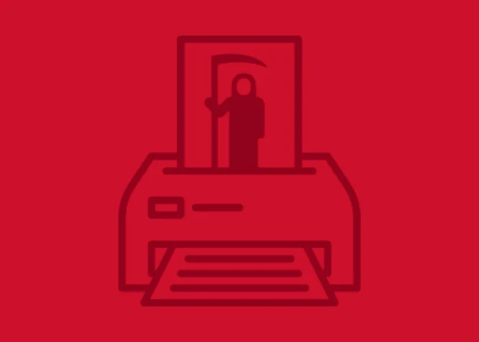
The Death of Print? Maybe Not…
Gone are the days of mass produced communications, with mailing list volumes in the hundreds of thousands. Our digital capabilities are now far more sophisticated, and we have developed means of reaping valuable consumer insight, with clever ways of communicating to our customers instantly. But that doesn’t mean print is dead. Printed matter, when used correctly can reinforce and elevate any brand. Here are a few ideas on how to make print work for you.
Gone are the days of mass produced communications, with mailing list volumes in the hundreds of thousands. Our digital capabilities are now far more sophisticated, and we have developed means of reaping valuable consumer insight, with clever ways of communicating to our customers instantly. But that doesn’t mean print is dead. Printed matter, when used correctly can reinforce and elevate any brand. Here are a few ideas on how to make print work for you.
Talk to me.
As marketeers, we strive to speak to the right customer in the right tone, ensuring that every touch point is relevant and hardworking. The development within digital print has meant that we can exploit our customer knowledge and drive conversion. But this information can also be used to reinforce brand values. When I bought my new Mini, I received a simple A5 postcard from BMW, with an exact image of my car, and messaging “The wait is almost over”. I can’t describe how excited I felt. A personal message (without repeating my name ten times!), which made me feel valued and reinforced the individual nature of the Mini brand. I imagine the cost to BMW was minimal, but the impact was massive. The fact that this wasn’t an instant, automated email only served to enhanced the value.
A break from the screen.
Touch is one of the 5 senses, often underestimated in a digital age. As we shop, converse and research online, the good old-fashioned brochure is often left by the wayside. I think about the way I feel when my White Company brochure, or Cath Kidson brochure lands on the doormat. Beautifully printed on uncoated stock, the texture exudes luxury and reinforces the brand, and I want to take time (another modern day luxury!) to savor it, without it being backlit. Ikea have summed this up beautifully with their bookbook campaign https://www.youtube.com/watch?v=MOXQo7nURs0, sometimes you just can’t beat the printed form (although I may check availability and order online!).
Go beyond CMYK.
Seek out innovation, and use it sparingly to drive your brand forward.
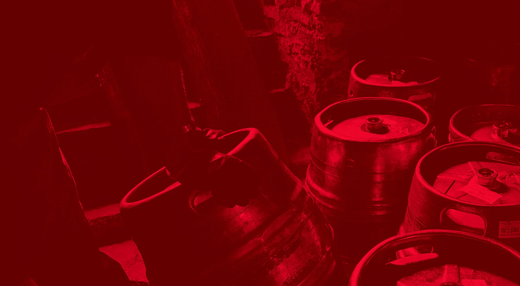
Recently, Truth produced letterheads as part of the rebranding for Robinsons Brewery. The design was simple and stunning, and it would have been so easy to produce standard CMYK letterheads (which would have being stunning too). However, we took the print up a notch by adding a laser compatible foil and the result is fabulous. With a foil integral to the design, it reinforces the heritage of the brand, and the ongoing commitment by Robinsons to quality. It’s simple, and beautiful, and it works.
It’s about who you know.
I am often faced with challenges I haven’t tackled before (it’s the nature of production!) and I know that the key to achieving the best possible outcome from my clients is the relationships I have with my suppliers. Always keep a keen an eye on print costs, but never underestimate the value of a good quality printer. When I discover a reliable supplier, I hold on to them, drawing on their knowledge and expertise, and reassured in their ability to do a good job. You get what you pay for, and investment in a strong relationship with innovative print partners will pay back dividends.
Keep it simple.
As technology develops, there is a tendency to adopt new techniques ASAP, and over use them. This doesn’t always support the brand, and can often undermine it. A simple, straight forward brand doesn’t need bells and whistles and uber personalisation, it needs straight forward print. Select the right substrate, and a 4pp A5 can work just as well as a complex one piece mailer. Simple.
To conclude, printed materials are as relevant to marketing today as they have always been. Maybe there isn’t as much profit as their used to be, so printers need to be more innovative. As long as the thinking is good, the channels are considered and the end product is representative, print will always be of value to any brand.
Written by
Sue Holt
Senior Account Manager
Truth

Truth PR – Happily spilling the beans since 2010.
“A PR agency called Truth, that’s an oxymoron isn’t it?”
I get asked this question A LOT. And courtesy calls for me to nod and laugh politely but the truth is (there’s that word again) it perfectly represents everything we stand for and have since our inception.
“A PR agency called Truth, that’s an oxymoron isn’t it?”
I get asked this question A LOT. And courtesy calls for me to nod and laugh politely but the truth is (there’s that word again) it perfectly represents everything we stand for and have since our inception.
We don’t believe in fobbing off clients with marketing jargon and hyperbole, nor do we attempt to bedazzle our clients with services that are undeliverable and results that are unachievable.
We have built our success over the past 5 years on straight-talking transparency and doing exactly what we said we would do. If it can’t be done, we say at the outset. If there is a better alternative to what you think you need, we make our case. Even if that better alternative is doing nothing at all.
We won’t just take your money and run. We’re in it for the long-term and we’d rather do the right thing for your brand and hope that maybe you’ll think of us again the next time you need some PR assistance.
There are also times when our strategic and meticulously planned campaigns and activities don’t work out as we expected them to, despite our best efforts. Sometimes, the universe just has other ideas and unfortunately in the big wide world of PR, there are factors beyond our control that can affect the results we were aiming for. But if we are going off course, we make it known, along with a clear explanation as to why and most importantly, what we’re going to do to fix it.
There are even, dare I say it, rare occasions when we make mistakes. (Ha! You weren’t expecting me to say that were you?) But the thing is, the human race is flawed and whilst we have numerous agency systems and processes in place to prevent errors, the odd oversight can slip through. Any agency that tells you otherwise is being dishonest.
I’m pleased and relieved to say that mistakes happen very infrequently here at Truth HQ (thanks in no small part to my merry team of perfectionists) but they do still happen and when it does, we own up. We spill the beans. We don’t hide behind excuses or suddenly become unavailable. We come to you with our hands up, apologise and sort it out.
This level of honesty isn’t everyone’s cup of tea. Some need a little sugar in their coffee. (Hot drink anyone?) We’re outspoken and we don’t mince our words because we think in this busy, technology-fuelled age, time is precious. We’d rather not waste your time or ours when we could spend that time providing services or solutions that will add value to your bottom line.
It’s all just good customer service as far as I’m concerned and the reason why our clients stick with us. They come to us for our PR expertise and strategic creativity and they stay with us because they know they won’t get this level of service from anybody else.
And that’s the truth.
Written by Lisa French
Managing Partner – Truth PR

SEO – it’s easy, isn’t it?
Somebody asked me recently if their website should have SEO in it. (Or ‘Essy-Oh’ was actually what was queried). My answer was of course ‘Well, yes’ (obviously). After all there’s little point having a website that isn’t optimised (or Essy-oh’d - a term I am now rather fond of); it would be rather like writing a book and not putting it on Amazon.
Somebody asked me recently if their website should have SEO in it. (Or ‘Essy-Oh’ was actually what was queried). My answer was of course ‘Well, yes’ (obviously). After all there’s little point having a website that isn’t optimised (or Essy-oh’d - a term I am now rather fond of); it would be rather like writing a book and not putting it on Amazon.
But the question led me to wonder about the myth behind SEO and if there is a way to explain it simply. My pondering, unfortunately, resulted in the conclusion that actually there isn’t, because it’s rather a complicated process. Which isn’t a bad thing in all honesty because it keeps people like me in a job.
The good news is that there are some simple techniques that anybody who owns a website can adopt to improve their organic listing in search results.
The first point to make is to clear up any confusion between SEO and PPC. SEO = Search Engine Optimisation. PPC = Pay Per Click. They are two separate things and either one, or preferably both, should be taken into consideration in any decent search strategy.
The second point to make is that Google handles around 96% of search traffic in the UK, so if your audience is solely or predominantly UK based, then stick to Google’s algorithms and you can’t go far wrong.
5 tips to help improve your SEO:
Content.
The phrase ‘content is king’ is nothing new, but it is true. Content on a site is one of the first things Google will look at and rank it in terms of writing quality, keyword inclusion and user engagement. There are several things to consider; Google is very clever at noticing overuse of keywords, so make sure they are there, but don’t overdo it. Keeping content across your site fresh and topical will engage visitors and reduce bounce rate, so if you have a blog or a news feed then make sure you are updating them regularly.
Build quality.
This will have a definite impact on how high, or low, your site is listed. This is down to the developer and best practice dictates certain requirements. Firstly, a site description is a must but all too often missing on poorly built sites. Pages should be titled sensibly and given meta description tags, and headers and subheads should use header tags with relevant keywords.
Architecture.
Google needs to be able to ‘crawl’ web pages easily so attention should be given to site architecture. Load time and individual page URLs should also be considered, and a responsive site for tablet and smartphone users will rank higher than a desktop-only build.
Links.
This is important because things can go horribly wrong if dealt with incorrectly. Links to other pages on your site is good. Linking to other, credible sites that your visitors will also find interesting and useful, is good. Linking to random sites and allowing same random sites to link to you, is bad. Overdoing links is also bad. Be careful, Google is far more intelligent than you or I!
Social.
Engaging in social media can positively affect your SEO. Whether you use Facebook, Twitter and/or LinkedIn, make sure you have easily accessible links from your website. Encourage your users to engage with you on these platforms as Likes, Shares, Posts and keyword Hashtags will impact on your site’s trustworthiness and your reputation.
I wish I could tell you that was all there was to it, but the truth is that there’s a whole lot more. And a lot more ‘do nots’ as well, but we’ll save those for another blog!
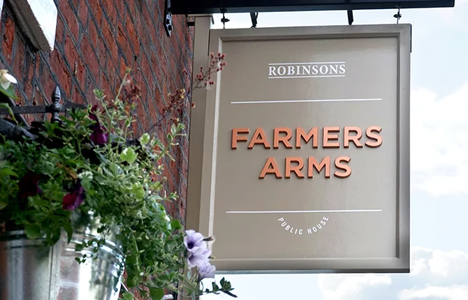
Truth Helps Robinsons Brew a New Look
Family-run brewery, ROBINSONS is undergoing a company-wide rebrand commencing with a new logo design by Truth Creative; a design, PR and digital agency based in Manchester.
Family-run brewery, ROBINSONS is undergoing a company-wide rebrand commencing with a new logo design by Truth Creative; a design, PR and digital agency based in Manchester.
The brand revamp comes as Robinsons prepares for its biggest investment into its 300-plus pub estate to date. This includes fresh pub signage as well as new pump clips, bottle labels, merchandise and literature and a newly designed corporate website.
“We have modernised, refined and simplified the brand mark to be bolder, more dynamic and future proofed. The new brand identity is therefore distinctive without detracting from the Unicorn motif, which has formed the backbone of Robinsons’ respected lineage and represents the company’s values as an independent family brewer. Likewise, we have harnessed the colour copper because as a material it is intertwined with the craft of brewing and beer. It also has a strong presence throughout Robinsons’ Visitor Centre, including the reconditioned Copper vessel which served the brewery for more than 80 years.”
Darren Scott – Founder and Creative Partner, Truth.
Handcrafted in the historic market town of Stockport since 1838, Robinsons has evolved from a local Stockport brewer to a multi-million-pound establishment owning over 300 pubs across Cheshire, Lancashire, Derbyshire and North Wales. With the sixth generation now at the helm, Robinsons continues to offer a wide range of award winning ales, ranging from heritage brews (such as Old Tom and Unicorn) to lively young ales (such as Dizzy Blonde and TROOPER; brewed in collaboration with Iron Maiden). It’s a winning formula that has earned the company worldwide recognition.
“We have a wonderful tradition of strong brand identity that stems over 176 years. As custodians of our family business we have now reached a point to move forward with its development and in doing so take a tighter control of our image, how we portray ourselves and importantly our tone of voice. Following heavy investment in our pubs, brewery and beers, we felt it was the perfect time to brew a new look and redefine our positioning.”
Oliver Robinson – Joint Managing Director, Robinsons.
“I want to acknowledge the support and contribution of Truth, who have developed the new look for Robinsons. They clarified through a meticulous process the importance of owning and taking control of our brand, but also allowing it to evolve and breathe. From the onset they understood us and what Robinsons was all about. They were sympathetic to our traditions and heritage, but equally the need to drive forwards and deliver the company's ambitions for the future.”
Neil Robinson-Stanier – Director, Robinsons.
To hear more about our work for Robinsons, any of our exciting new projects,
or if you just fancy a catch up – get in touch…

Truth creates AJ Bell’s annual event to financiers
Truth was appointed to deliver AJ Bell’s annual conference in London. The conference for 2014, aimed at financial advisers, provided an opportunity to hear from some of the industry's most respected commentators.
Following a 3-way pitch, Truth was appointed to deliver AJ Bell’s annual conference in London.
The conference for 2014, aimed at financial advisers, provided an opportunity to hear from some of the industry's most respected commentators. Truth’s objective was to run a memorable campaign to capture the interest of AJ Bell’s key audience and build excitement for the event, with the ultimate objective to recruit delegates.
“Truth delivered a memorable campaign on time and to budget across multi-channel platforms. We were thrilled with the demand for tickets compared to last year’s event.”
Hannah Purslow – AJ Bell PR and Events Manager
Using one of Britain's favourite pastimes, Truth created a campaign theme to link the company’s principles to music: enabling both stand out and reach within a diverse audience. The launch of Investival saw campaign activity across web, eDM, social media, motion graphics, and both event branding and collateral.
The successful campaign delivered ticket sell out within four weeks of launch via e-Marketing and social media engagement – removing any further investment across press based media activity and direct marketing.


To hear more about our work for AJ Bell, any of our exciting new projects,
or if you just fancy a catch up – get in touch…